
Vue
TailwindCSS
Ark UI
Vue UI is a library of Vue components build with TailwindCSS and Ark UI that are dsigned to be copied and pasted into your project.
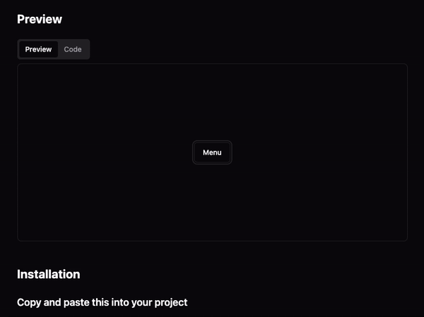
Example
A lot of the styling and functionality is inspired by shadcn/ui, and I wanted to expand the idea to other frameworks so I began with Vue as that was the first framework that I properly learnt.
I am hoping to build a solution for all frameworks in the future, but for now I am focusing on Vue.
Challenges
My first hurdle was the biggest difference between Vue and React architecture. Vue prefers single file components, whereas React allows for multiple components within a single file. This allows easy imports of sub components as such:
import {
  Dialog,
  DialogContent,
  DialogDescription,
  DialogFooter,
  DialogHeader,
  DialogTrigger,
} from '@/components/ui/dialog'
Recreating this in Vue would require individual files for all of the sub components and an index file to export them all. This is not ideal as the biggest selling point of the original library is the ability to copy and paste components into your project.
Luckily, Vue does allow for multiple components in a single file, but it is not the recommended approach. I decided to go with this approach, however, as it was the best solution for my use case.
To do this, I had to use the defineComponent function from Vue to define the components. This was great as it allowed me to define as many components as I wanted in a single file.
I soon found a big hurdle with this solution - TypeScript support. When prop spreading (passing all props to the child component), TypeScript does not know what props are available on the parent component.
I had the prop typings but there was no easy way to tell defineComponent that the same props were available on the parent component.
After a lot of trial and error I created a generic type that would take the props of the child component and apply them to the parent component. This allowed me to pass all props to the child component and have TypeScript know what props were available.
type RemoveDynamicKeys<T> = {
  [K in keyof T as string extends K
    ? never
    : K extends number | typeof Symbol.iterator
    ? never
    : K]: T[K]
}

export type ExtendProps<Props> = RemoveDynamicKeys<
  Required<{
    [key in keyof Props]: {
      type: PropType<Props[key]>
      required: undefined extends Props[key] ? false : true
    }
  }>
>
const Select = defineComponent({
  props: {} as ExtendProps<SelectProps>,
  setup(_, { slots, emit }) {
    return () => (
      <SelectPrimitive>
        <div class="grid gap-2">{slots.default?.()}</div>
      </SelectPrimitive>
    )
  },
})
This is an OK solution and works as it is but feels very hacky. However, when I create the future solution for all frameworks I will change to single file components and allow devs to download and drag and drop the entire folder. This is not only easier to maintain but it also is easier for devs to edit and change the components to their liking.